Create a 0-1 MVP to simplify grocery shopping for dietary preferences
My role
I led end-to-end design from discovery to delivery—including product strategy, UX/UI, branding, and MVP execution. I collaborated closely with the founder and design team to bring the 0→1 mobile app to life.
Project Type
To C mobile app
0-1
MVP
Launched
Sector
Health
Tool
Team
Founder
2 Product designers
Outcome
Leading Design Through Ambiguity: Achieving 85% User Satisfaction
At the beginning of 2024, Sanket, the founder of IngrediCheck, realized that existing apps did not adequately meet the needs of his family and friends with various dietary restrictions. He brought his idea to Studio Salt, hiring us to turn it into a product from the ground up from a product design perspective.
Impact
Ultimately, we beta tested our app with five potential users before the launch in May, achieving an 85% user satisfaction rate. Here are two quotes from our participants:
Annie
“It's like having a personal dietitian in my pocket, helping me avoid allergens and stick to my dietary preferences effortlessly.”
“I often have a hard time collecting everyone's dietary needs when I host parties, but with IngrediCheck, I can easily gather my guests' preferences and shop for the right food for them.”
Caleb
I am also seeking post-launch data, such as user retention rates and the frequency of shared preference list usage, to validate the effectiveness of our design solution for users.
Context
How might we simplify grocery shopping for people managing multiple dietary preferences—especially when shopping for others?
Have you ever struggled to read long, complicated ingredient lists? For those with dietary preferences, this can be especially frustrating and time-consuming.


Despite several apps on the market, the founder of IngrediCheck found that none adequately met the needs of users with dietary restrictions. These apps offered only generic options and lacked precise input for specific dietary preferences.
Inspired by this gap, he envisioned an AI-powered app to enable precise input of preferences and allow label scanning for compatibility.

While the founder initially believed that accurate preference input was the core need, we recognized a gap between this input and the actual product values users want. This realization led my team and me to focus on true user needs.
Dig out true user needs
People need help communicating dietary preferences to others
Find out accurate preference input for what?
To gain insights, I proposed conducting user interviews alongside a competitive analysis.
1
User interviews
We interviewed 6 individuals who, or whose family members, had dietary restrictions.
Initially, we believed that individuals primarily shop for themselves and struggle to find suitable foods. However, we discovered that they often choose familiar items and seek assistance only when trying something new. In contrast, those shopping for others or for social gatherings face even greater challenges due to the pressure of accommodating multiple dietary needs.
Users:
People who need to check food for dietary preferences
Caleb, father of 4 kids
Create shopping list before shopping
Difficulty educating others about their dietary restrictions
“When I send my kids to their grandparents, they often don’t know what foods the kids can eat, and I struggle to explain it all to them.”
2
Competitive Analysis
We continued our research with a competitive analysis of the four most popular products recommended by our interviewees. We not only tested these apps but also reviewed their app store feedback to identify user needs.
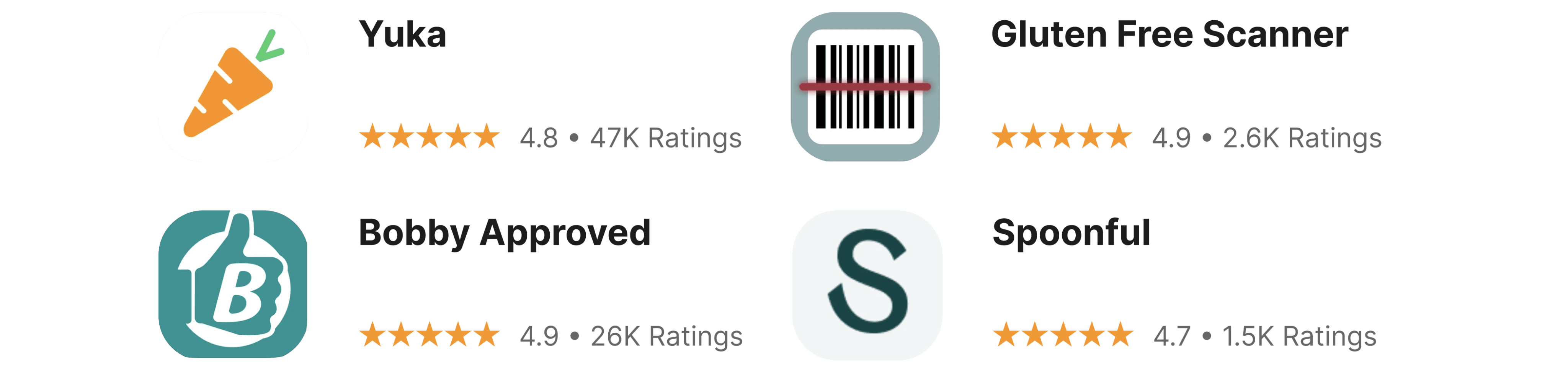
Our experience with these apps confirmed that they lack accurate preference input, with one even lacking a preference setup feature.

Gluten free scanner
Only can scan for gluten free
Yuka
Only have limited preference options

Spoonful
Only have limited preference options
Additionally, I found that while Yuka and Spoonful provide detailed ingredient scores, their scoring systems often confuse users. Even after reviewing all the ingredients, users frequently remain unsure about whether to purchase a food item. This insight influenced our design strategy to prioritize simplicity, ensuring clear indications of whether a product aligns with users' dietary preferences.
Research Insight
1
The real problem is not checking, it’s communicating preferences—especially when shopping for others or at social events.
2
Ingredient scores lead to confusion. Users don’t want a breakdown—they want a clear yes/no answer on whether something is safe to eat.
Strategic solutions
Simplify and focus on user needs (check & share)
After uncovering the true user needs, we were able to orient our features and designs around what users actually want.
Encouraging
Feedback
Easy to check and share
Keep simple
Design Goal
We aim to design a simple tool (MVP Version) that helps people quickly and accurately recognize what they can eat, while also improving how they communicate their preferences with others.
So, how exactly did we do this?
Prioritized two core use cases:
1
Check if a food item aligns with dietary needs (their own or someone else’s)
2
Share a dietary preference list with others (family, friends, caregivers)
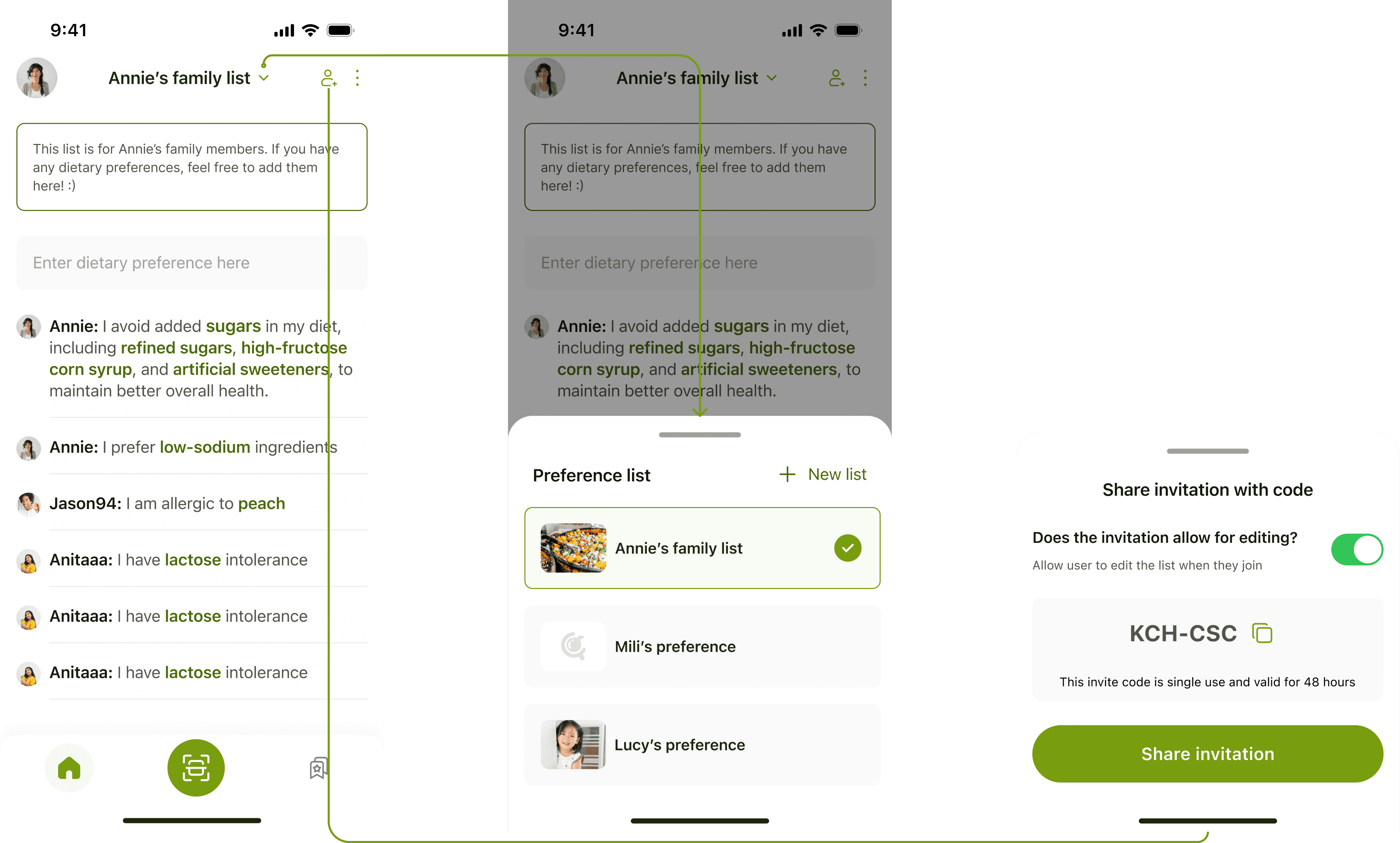
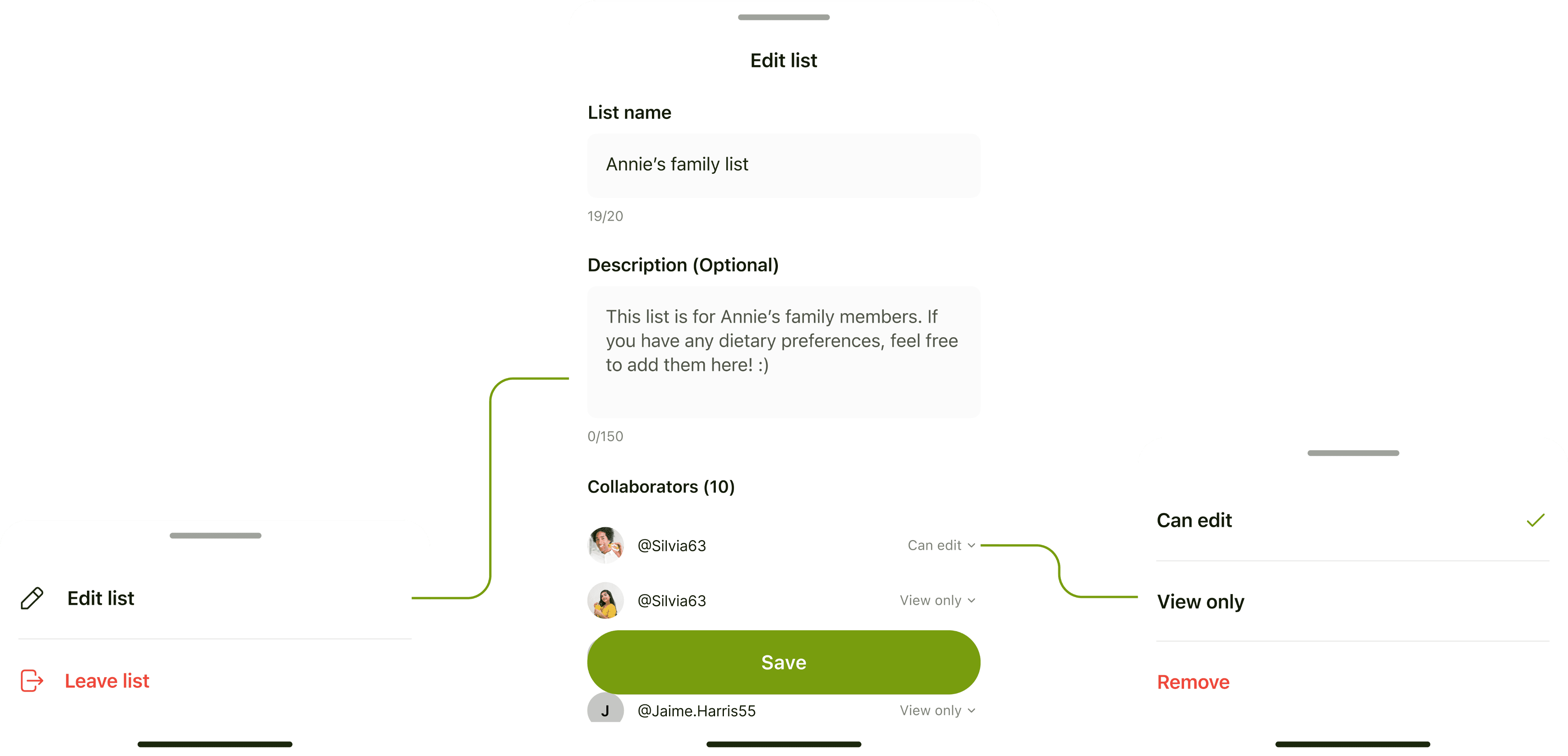
Key Feature 1: Multi-Preference Lists & Sharing
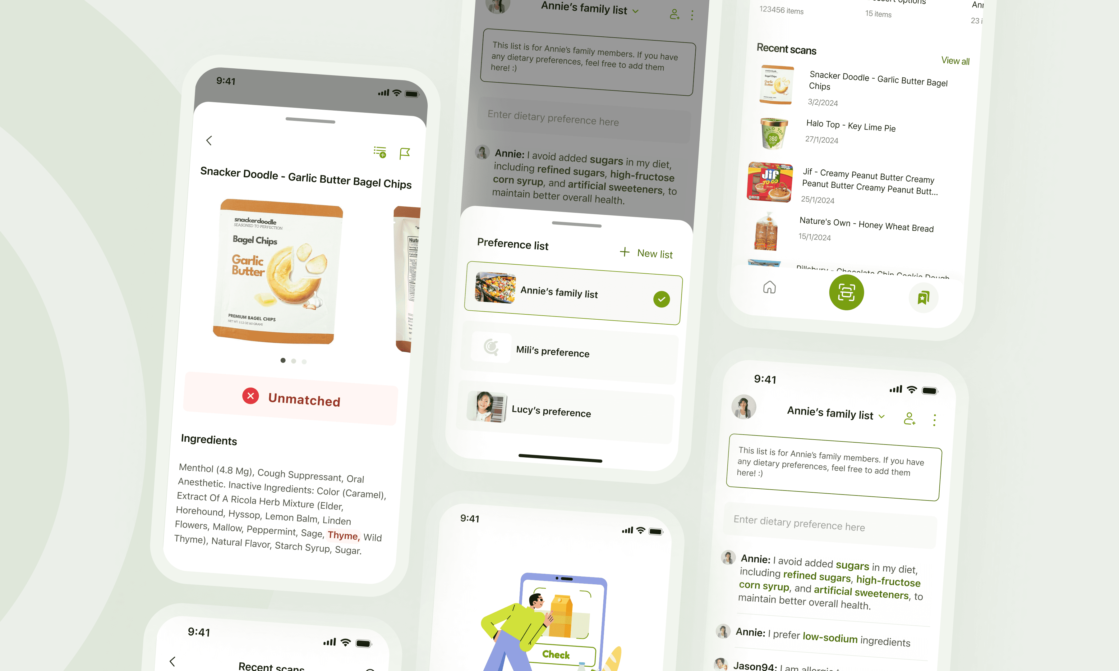
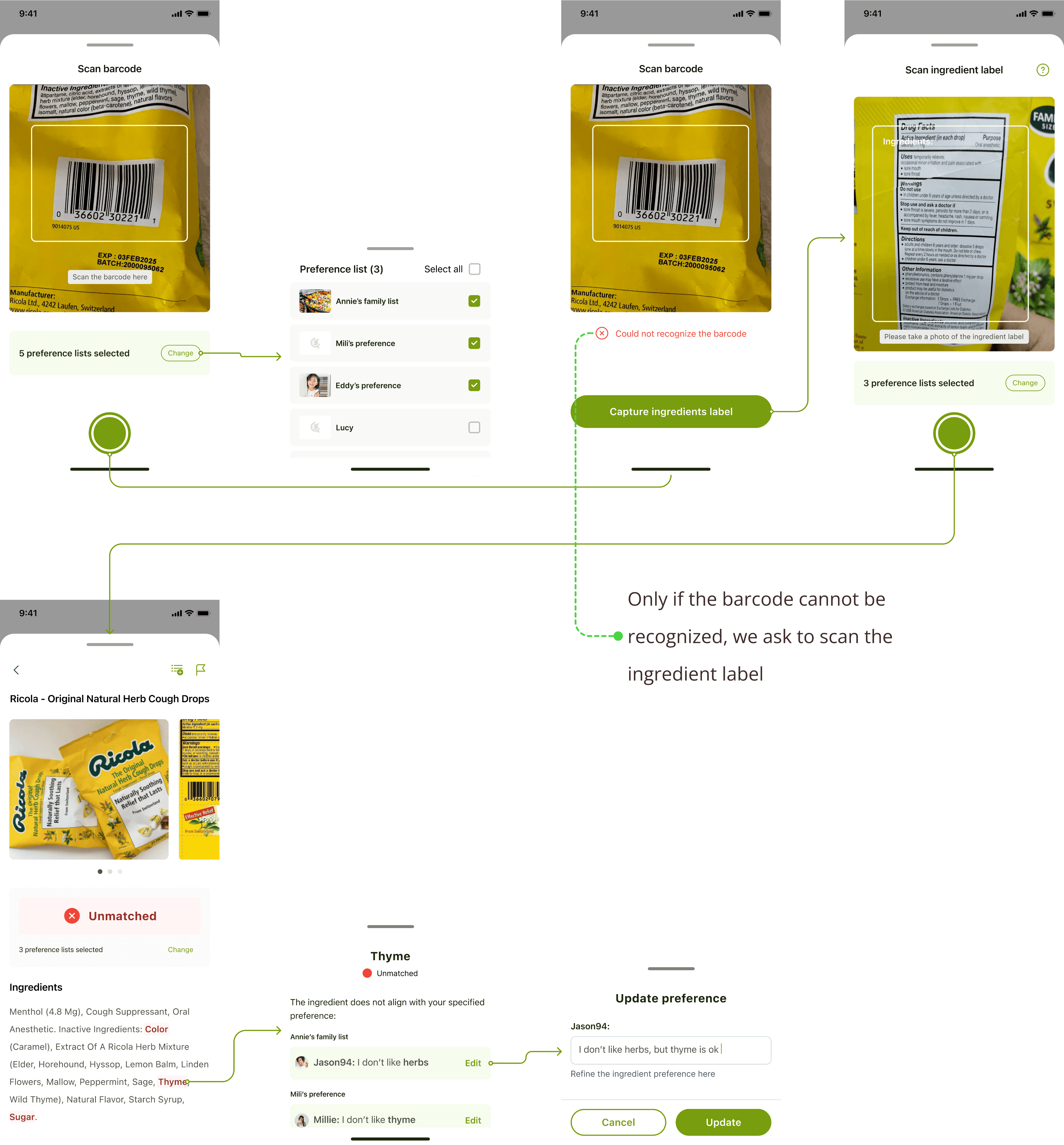
To solve the problem of communicating dietary needs, we propose allowing users to create multiple preference lists. These lists can be shared with friends and family, enabling them to download the app and directly scan food items using the shared preferences.
We initially designed two options for displaying multiple lists. After discussions with both the founder and the engineer, we agreed that a dropdown would be the simplest implementation and easiest for users to switch between lists. Since users typically check food only when needed, there’s no requirement to display extensive information for each list, such as update notifications. To enhance the manageability of the dropdown, I redesigned it as a bottom sheet, which aligns with our current design patterns.

To facilitate sharing, we aim to provide users with the simplest method for sharing their preference lists. Additionally, when multiple people edit the same list, we will include clear indicators to show who added each preference.
Sharing - After
Key Feature 2: Check Packaged Food & Save to shopping list
When designing the "Check Food" feature, we prioritized two core elements:
Simple and straightforward: We aimed to provide users with a clear indication of a food’s status, responding to our research insight that complex ingredient scoring system can confuse users. Our findings showed that users generally start by scanning barcodes, often misinterpreting nutrition labels as ingredient lists. To simplify the process, we designed the flow to prompt users to scan the barcode first, asking for the ingredient list only if the product isn’t found.
Encouraging User Feedback: Our competitive analysis showed that users become frustrated when scanning results are inaccurate. They wanted to provide feedback and expected developers to address these issues quickly. By integrating a feedback mechanism, we can improve the database and build user trust.
Scan ingredients - After
Reflection
When I reflect on this project, I realize it has been a profound learning experience in understanding the true role of a product designer, especially when building an MVP. It's about more than just designing flows, wireframes, and visuals; it's about being an active partner to the founder, guiding the product’s direction from the user’s perspective. This project reminded me that the essence of good design for an MVP is not just adding features to make it impressive, but also removing unnecessary elements and honing in on what users truly need.
I am also particularly proud that I stepped up to the challenge of leading this project, taking on responsibilities on the branding side I hadn’t handled before. I feel a deep sense of fulfillment seeing how this product is shaping up, and I’m excited for its future, with the hope that it will be the first of many more to come. 🤞
Logo

App store screenshots

Landing page