

Dell Technologies

Client Overview
Project Goal 🎯
Design Process 🧑🎨
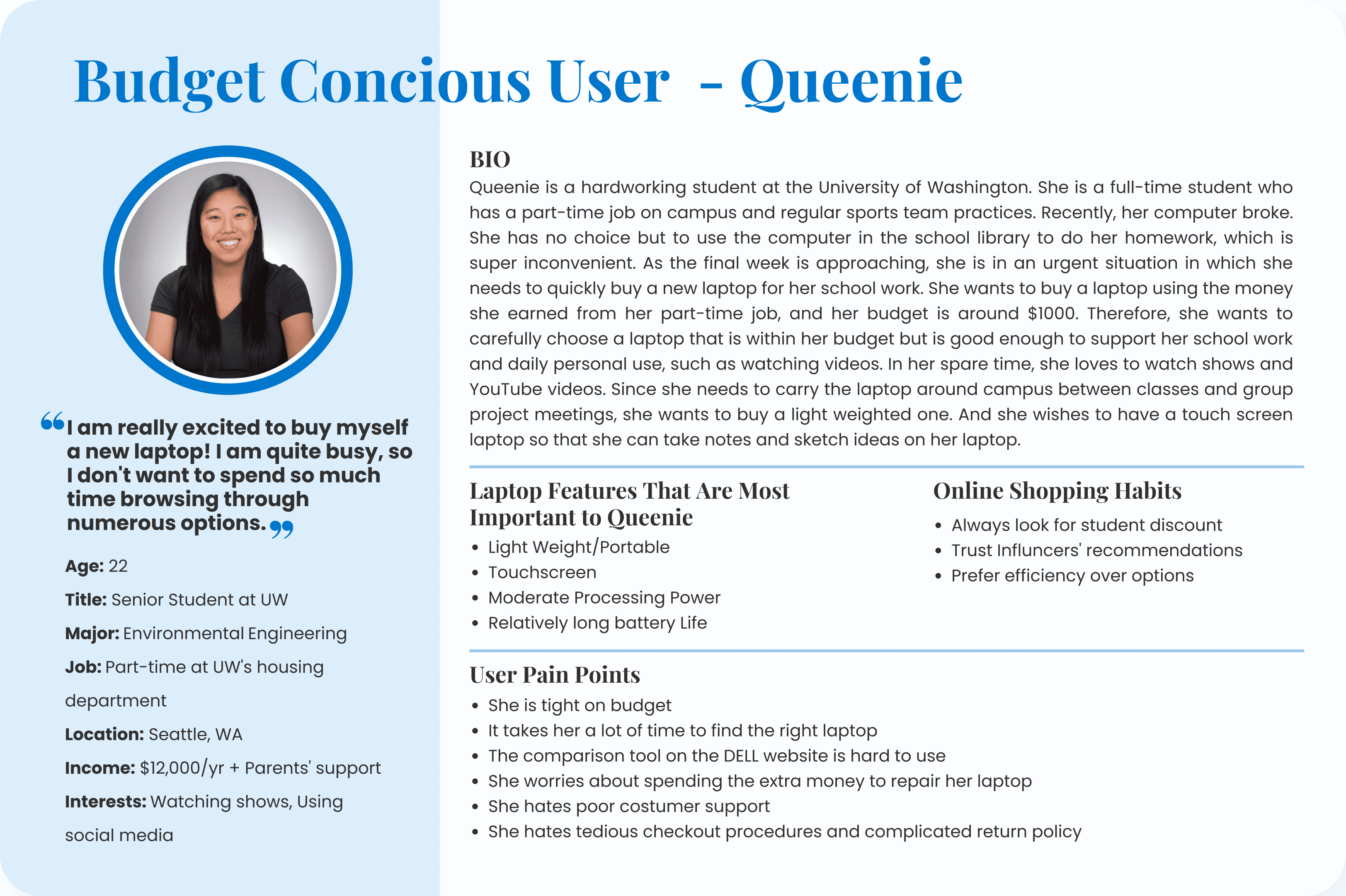
User Persona 👤
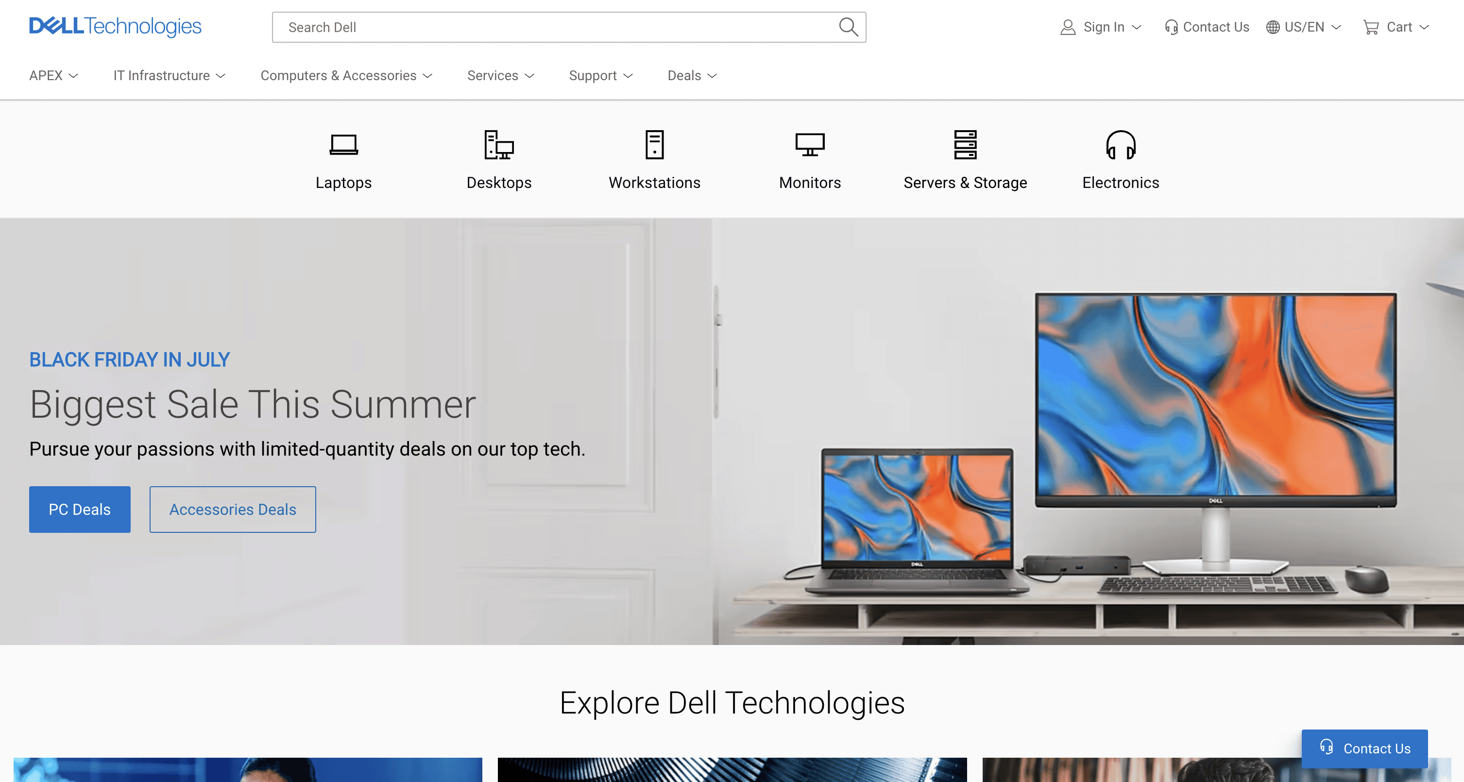
Dell is an American technology company that develops, sells, repairs, and supports computers and related products and services, and is owned by its parent company of Dell Technologies.
My goal is to test the Dell website's usability for students who are interested in purchase Dell laptops. And propose solutions that meet users' needs according to the heuristic evaluation and usability testing results.
The target market for Dell is students, employees, and small businessmen who need a new laptop with lots of features but don't have a lot of budget.
As for this case study, I chose college students as target users. Dell’s laptops are cost-effective for college students who need to complete a wide range of activities, from taking notes in class and completing assignments to streaming movies late at night in the dorm.
Discover
Develop
Define
Solution
Definition
Solution
Problem
Market research on target users
Make a persona
Survey
Heuristic evaluation
Usability research
Hi-Fi Prototype
Iteration
Final Solution Presentation
Ideate
Sketch possible solutions
Survey 📋
I conducted an online survey using google forms and got 57 response submissions to 10 core questions to find alignment with my user persona and further help me find the right users to be a part of the usability testing.
Below are the results from the survey:
Demographics
Gender
Female
68.4%
Prefer not to say
3.5%
Non-Binary
3.5%
Age
18-25
43.9%
26-35
42.1%
36-45
7%
Under 18
3.5%
Prefer Not to Say
1.75%
46 and older
1.75%
Laptop Purchasing Habit and Frustrations
The laptop brands they have shopped from in the past:
Competitors
Dell
Lenovo
HP
Microsoft
Asus
Sony
Other
Apple
(Ignore)
0%
10%
20%
30%
40%
Rank the specific factors you find important if you were to purchase a laptop:
Positive comments

Most Important
Somewhat Important
Less Important
Prefer not to say
Frustrations toward online shopping for a laptop:
Top 4 Answers
60%
45%
30%
15%
0
Finding the right product
Understanding the content
Check out process
Navigating site
From the survey, I learned that a lot of people are having a hard time finding the laptop they like. For people who are not tech savvy, I needed to strategize the content so that users can understand the specs quickly. Later, when I rearranged filter categories, I utilized the data we collected from the question, "Rank the specific factors you find important if you were to purchase a laptop" to execute the design.
Heuristic Evaluation 📝
Next, I conducted a heuristic evaluation on Dell's website. I have noticed four main user centered design principles that were being violated, as they either continued to reoccur in various forms and created one or more significant usability troubles.
These four problems are flagged as the main issues I plan to validate in usability tests later and the starting point from which I will also approach the redesign phase.
View the detailed heuristic evaluation here.
1
Lack of Consistency & Standards:Website’s navigation is inconsistent and incomprehensible, which would cause users to have difficulty finding the products they want.
3
Lack of Aesthetic Integrity: The style of the whole website is not aesthetically pleasing and negatively impact user experience
2
Lack of Linguistic Clarity: Website’s content are long and the information is in the same layout. There’s no distinction and hierarchy between different information.
4
Lack of Visibility of System Status and Responsiveness: Users do not know which step they are on during the check-out process, and they don’t know what filters they have selected.
Usability Testing 🔬
In order to test Dell website usability through a typical user journey of laptop purchasing, I recruited 12 participants who matched student customer persona. 8 of them are female, and 4 of them are male. They are either college students or pursuing master's degrees or higher.
The testing started from asking some easy questions about their laptop purchasing behaviors and their impression of Dell. Then I asked participants to complete three tasks (listed down below) to understand the usability issues with purchasing a laptop through Dell website. Lastly, I asked them questions about their overall experience after using the Dell website and some branding questions to better help us to understand how could I redesign and brand Dell differently to attract its potential costumers.
My usability script was designed to uncover qualitative and quantitive data to back up presumptions found in heuristic evaluation. Some metric I used to conduct the usability testings include task time, number of failed attempts, task satisfaction, and completion rate.
Whether the users were able to discover the task assigned which is to find a portable computer meeting their needs
Whether the users were able to recognize and use the comparison tool
Whether the users were able to modify the selected laptop and check it out without any hindrance
Task 1
Discoverability
Task 2
Use Comparison Tool
Task 3
Modifying Checkout Process

"Why is the website making me think so much, why can't they offer a straightforward solution"
"I would not recommend this website to other people unless I hate them."
"The website is pretty ugly, and fonts are small."
"Would prefer font text to be sized a bit lar ger and the color is not pleasing to them as they would have hoped. "
Key Quotes from Participants
Task #1 Testing Results
The Average time to find the laptop they interested was 3 minute
Minute
Participant
All of the users were able to discover a touch-screen laptop; however, the time and assistance varied from user to user. The average time to discover the right laptop was 3 minutes.
So... What has caused them to slow down the process?🤔
On average, they questioned, "What should we do?" and "Where should we go?" 3 times each. This means that they were unable to locate the option for touch-screen laptops in the filter section, which caused the process to take longer.
Unlike Task #1, for Task #2, out of the total 12 participants, only 5 of them can successfully use the comparison tool.
Task #2 Testing Results
Failed
58.3%
Succeeded
41.7%
For those who have successfully use the comparison tool to compare laptops, the average time taken by a participant to use the tool was 1.8 minutes.
The average time to use the comparison tool was 1.8 minutes
Minute
Participant
So... What has caused them to slow down the process?🤔
On average, they questioned, "Where is 'the compare button'?" 4 times each. This means that they had a hard time using the comparison tool, which caused the process to take longer.
Task #3 Testing Results
Although the checkout procedure took just one minute on average, it was difficult to discover the 'edit' button at the Add to Cart page, which lengthened the users' time.
The Average time to complete the checkout was 1 minute
Participant
Minute
So... What has caused them to slow down the process?🤔
On average, they asked, "How should I make modifications to this laptop?" or “how can I edit?” 3 times each. This means that they had a hard time to find the edit button.
Solutions 🪄
Through my solution I wish to enhance the Discoverability, Legibility, Consistency of Dell Website.
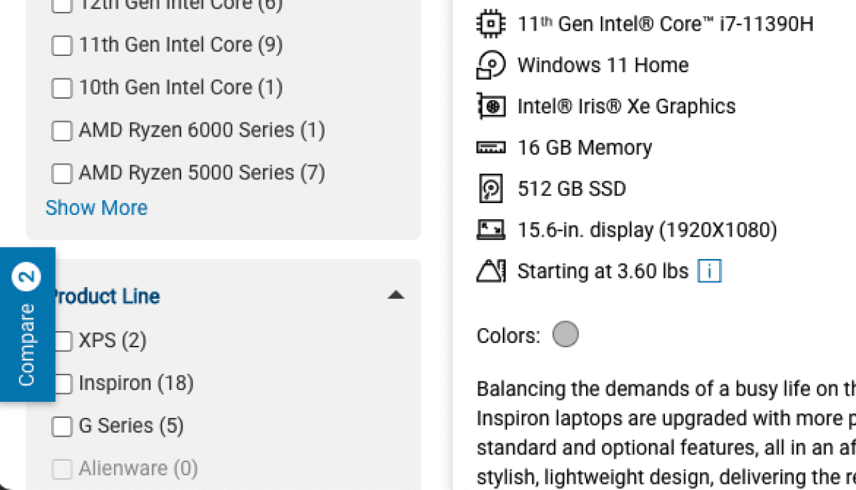
Filter Issues

"Where is the touchscreen option?"
"Wow, the filter is so long."
"I'll have to use control F to search ‘Touchscreen’."
Change category name from “Factor” to “Features”
Change “2-in-1” to “Touch Screen”, which is easier for customer to understand
8/12 participants have a hard time finding the "touchscreen" option. (Some of them end up using Control+F to search the keyword"touch".)
No prioritization:Order of the filter does not meet users' expectation
Prioritize filter and combine similar categories (progressive disclosure)
Default to minimize all the categories (Because there’re too many categories
Eliminate unnecessary categories based on our survey results
Increase font size
Before
After


Refine By
For Home
For Business
Product Line
Price
Features
Backlit Keyboard
Touch Screen
Fingerprint Reader
Wi-Fi 6
Screen Size
Screen Resolution
Storage Type/Size
Memory
Processor
Processor Platform
Costumer Rating
Color Options
Filter By
For Home
Touch Screen
Comparsion Tool Issues
"Oh! I didn't notice the comparison tool."
"Why are there so many buttons? I am confused."
"Do I have to u ncheck them one by one?"

Only 5 out of 12 users used the comparison tool when asked to review items
The compare check boxes are easy to miss
After users check the box, the compare check box turns into a blue button, which creates confusion
The floating comparison cart is not shown at default. And while it's active, elements of this cart are distracting
0/12 users noticed this comparison cart on the left
No delete button
Change compare checkbox to button
"Added" button status to inform successful action
Default to show the comparison cart when users click the compare button
Added “Delete” button and “Clear All” button


Before
After

Compare
Compare
Added!
Added!

Compare Products (2)
Clear all
Compare
"Where is my previously added laptop?"
"The "Edit" is so small! How can I find that?"
"I'll just click the go back arrow on my browser to make the change on the warranty"
Cart Issues
Before
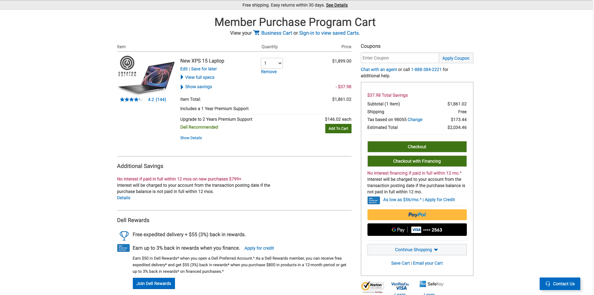

The "Add to Cart" button is the same color with the primary CTA button
The "Edit" is hidden and blended with other information
4 users mentioned that the switch cart button is hard to find
Big chunks of information and are repetitive


Edit Specs
1234
Save Cart | Email Cart
Use segmented control for switching the cart
Add a progress bar to inform users the system status
Change “edit” to “edit specs”, which is easier for users to understand what will be edited
Button hierarchy:Change the style of buttons
Merge Checkout Buttons
Make the primary CTA more visible
Eliminate repetitive information
Add estimate delivery date
Home
Business
Cart
Add To Cart
Warrenty & Software
Accessories
Review Cart
Checkout
Complete Order
Proceed to Checkout